

Business analytics, training courses, marketing campaigns — every field needs compelling data visualization. The classic problem: designing infographics eats up hours choosing a composition, finding a matching style, and displaying data correctly. Modern neural networks turn this into a five-minute task.
AI visualization services transform raw data, text briefs, and voice descriptions into charts. Massive reports, business analytics, and complex presentations are now created almost instantly. This saves resources for companies without in-house designers — and frees professionals from mechanical work.
Why use neural networks for infographics: Experience from marketers, teachers, and analysts
Real-world cases from business and education show a clear need for instant visualization. Marketers use text-to-infographic generation for quarterly reports. Teachers use it for interactive diagrams in class. Analysts use it to process massive datasets. Speakers use it to prepare presentations before talks.
AI creates visual content that radically shortens the cycle from concept to result:
- Automates data formatting with neural networks in a second.
- Generates charts and tables from text, eliminating manual layout.
- Builds mind maps with a neural network from a voice request.
Users get finished data visualizations from neural networks practically in real time. This is critical under deadlines — an urgent presentation for an investor or the need to reformat a report for a new audience right before a meeting.
What tasks AI services cover
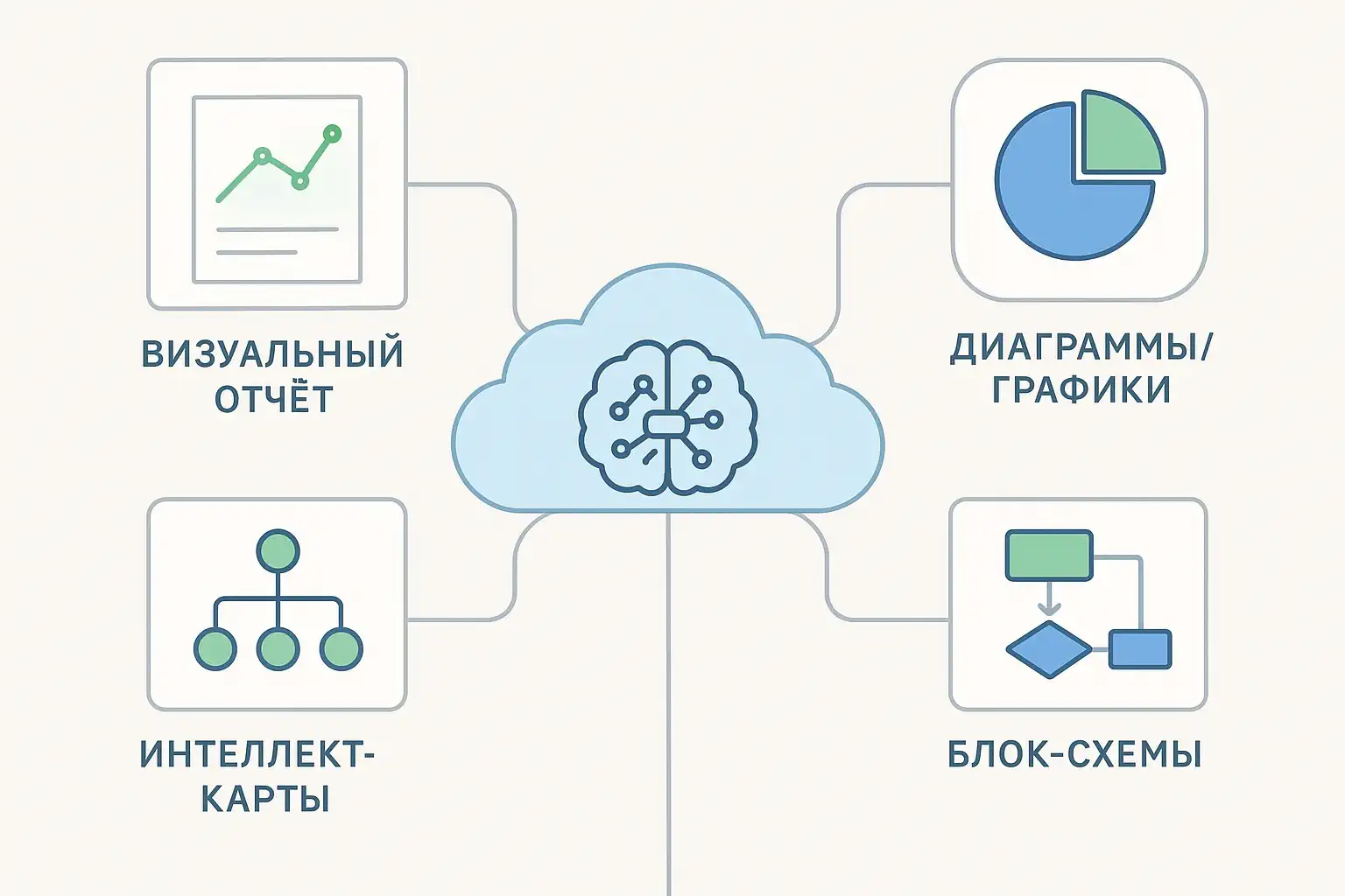
Current AI infographic tools cover the full range of visual tasks:
- Generating a visual report from a text description or a data array
- Creating charts and graphs with instant export
- Building mind maps or flowcharts for strategic planning
- Assembling infographics for a presentation directly in a slide editor
Beginners value intuitiveness — describe the task, get a visualization. Advanced users want detailed customization, brand palettes, and API integrations with corporate systems.
What modern AI infographic services can do
A common problem is complex tabular information. Now it's enough to enter text or upload a file. A neural network for data visualization analyzes the meaning and structure, highlights key blocks, and automatically turns them into an infographic.
Typical capabilities of such platforms
Automatic chart creation: bar, pie, line
- Converting data and text into a visual format — infographics from a description
- Fast formatting of business reports
- Embedding infographics into a finished presentation (slides structure themselves)
A modern online infographic generator offers templates for any topic and lets you change the layout, colors, and details in just a couple of clicks. Reports and presentations can now be assembled at a prototype level in 10–20 minutes instead of hours of manual design.
Top neural networks for creating infographics available in GPTunneL
You can turn raw data and text descriptions into professional visualizations in minutes. Let's look at the most effective models for creating business infographics.
1. Claude 4 Sonnet
Claude 4 Sonnet leads in complex visualizations thanks to its ability to analyze data and generate code for interactive charts. The model processes CSV files, determines the optimal visualization type, and creates ready-to-use Python code with Plotly or Matplotlib.
Key capabilities:
- Analyzing tabular data with automatic chart-type selection
- Generating interactive dashboards with drill-down functionality
- Creating animated visualizations for presentations
Example prompt: "Analyze sales_data.csv [your sales data file] and create an interactive dashboard with three key metrics: monthly sales trend, top 5 products by revenue, geographic distribution of customers. Use corporate colors #1E3A8A and #10B981"
2. GPT Image 1
GPT Image 1 is an image generation model that can take reference images and text commands. This makes it a versatile tool for creating data visualizations. The AI understands the context of a business task and creates both analytical charts and conceptual illustrations for presentations.
Model features:
- Multimodality: analyzes reference images and creates visualizations in one session.
- Iterative refinement through natural language
- Ability to switch between three versions: Low, Medium, and High, which differ in price, quality, and generation speed.
Example prompt: "3D bar chart of quarterly profit, where the bars are made of stacks of realistic dollar bills. Four bars for Q1–Q4 2024 with data: Q1=$2.3M (height 40%), Q2=$3.1M (height 55%), Q3=$4.5M (height 80%), Q4=$5.6M (height 100%). Quarter labels at the bottom in white font, amounts above each bar in bold green. Background — blurred modern office. Professional lighting from the upper left, 45-degree angle view, shadows to the right"
3. Gemini 2.5 Pro
Gemini 2.5 Pro stands out for its ability to process huge volumes of data (up to 1 million tokens) and create complex, code-based visualizations. The model works effectively with time series, correlations, and multidimensional data, and has access to various libraries, just like Claude 4.
Model features include:
- Processing data from multiple sources simultaneously
- Automatic detection of patterns and anomalies
- Generating explanatory text for charts
Example prompt: "Combine data from three Excel files (sales, marketing, HR) and create a unified business performance infographic. Show the correlation between marketing spend, sales team headcount, and quarterly revenue"
4. Recraft 30B
Recraft 30B is an image generation model that lets you create infographics without restrictions. The model works with text, numbers, geometric shapes, and various backgrounds, which matters for visualizing business data.
Recraft 30B is effective for:
- Generating a large number of design variants
- Creating infographics in a corporate style
- Rapid prototyping of visualizations
Example prompt: "Business infographic showing customer journey: awareness → consideration → purchase → loyalty. Modern flat design, arrows connecting stages, icons for each stage, blue gradient background, white text labels, corporate clean style".
GPTunneL's Creative Lab offers image generation models from the biggest brands — Google, Stable Diffusion, Flux, Yandex, and others. Each model has its own strengths. The choice depends on the specific task: whether you need precise data visualization, a creative concept, or a photorealistic image for a presentation.
How to create an infographic with a neural network: Step-by-step guide
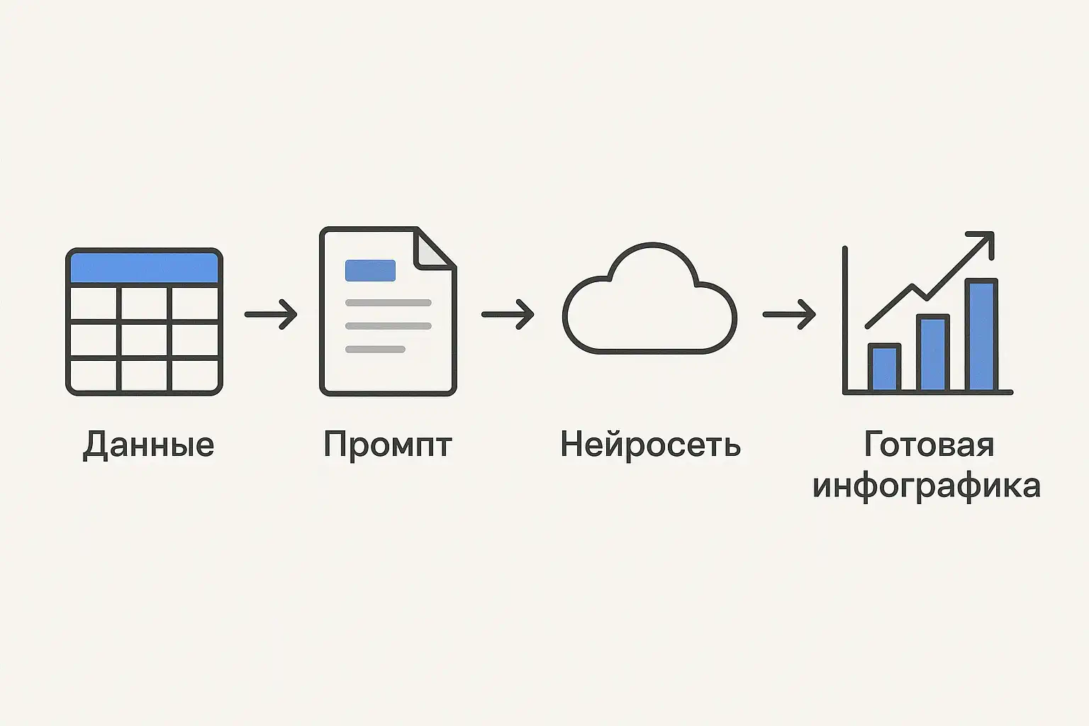
Imagine: a quarterly report due in an hour and the designer is on vacation. Sound familiar? Modern neural networks turn this problem into a five-minute task. Let's walk through a concrete example — visualizing sales growth by region.
1. Define the main idea
An infographic isn't just a pretty picture — it's a communication tool. Ask yourself: what decision will the viewer make after seeing it? Specify the context: are you comparing metrics, showing yearly dynamics, or highlighting problem areas?
2. Gather and structure the data
Neural networks work with different formats, but the more structured the data, the more accurate the result. If there's a lot of data, highlight the key points: top 5 regions, main trends. Remember: an overloaded infographic is worse than no infographic at all.
3. Write the prompt like a technical brief
A prompt is an instruction for the neural network. A bad prompt: "Make a sales chart." A good one: "Bar chart of sales across 5 regions for 2023. Data: Region A 45%, Region B 20%, Region C 15%, Region D 12%, Region E 8%. Corporate colors: blue #0066CC, gray #666666. Region labels at the bottom, percentages above the bars. Title: 'Sales Distribution by Region'."
4. Choose the right tool
For analytical charts, use Claude or Gemini — they understand data and create precise visualizations. For conceptual illustrations, GPT Image 1 or Recraft work well. Upload the data, paste the prompt, and get a first version in 30–60 seconds.
5. Refine to fit the task
The first version is rarely final. Most neural networks let you iteratively improve the result: "Make the bars 3D," "Add a grid for readability," "Make the title font larger." Export in the format you need — PNG for presentations, SVG for print.
Secrets of effective prompts:
- Structure matters more than length. Break the prompt into blocks: visualization type → data → style → formatting details.
- Use references. The phrase "in the style of Apple's annual report" gives a more predictable result than "beautiful and modern."
- Specify technical parameters. Aspect ratio (16:9 for presentations), resolution, color scheme (RGB or CMYK for print).
- Test variations. The same prompt in different neural networks produces different results — use this to pick the best one.
The main advantage of neural networks is iteration speed. In the time a designer needs for the first sketch, you'll get a dozen variants and pick the best one. This isn't a replacement for professional design, but a tool for quickly handling routine tasks.
Infographics for presentations: Automation and AI design
AI tools like Claude 4 Sonnet or GPT Image 1 are reshaping how presentations get made. Instead of hours in PowerPoint — upload data and get a ready structure with visualizations. Algorithms analyze the content, identify key messages, and automatically build a logical slide sequence.
Practical advantages of AI systems:
- Intelligent structuring: the neural network highlights the main points and builds a narrative
- Adaptive visualization: automatic chart-type selection based on the nature of the data
- AI design for presentations: consistent formatting without a designer
- Speed: creating a presentation with a neural network from brief to result — 10–15 minutes
Infographics from a description have become a breakthrough technology. Describe the task in natural language ("show revenue growth by quarter with emphasis on Q4"), and an AI-based chart builder generates the optimal visualization. All key formats are supported: vector graphics for print, interactive elements for the web, classic formats for corporate systems.
How to choose a neural network for a specific task
For corporate clients, formatting data with neural networks while following brand guidelines is critical. AI lets you upload guidelines and generate visualizations in your brand style. For startups, speed matters — GPT-4o creates pitch decks in minutes.
Neural networks for creating infographics:
- Analytics and dashboards: Claude 4 Sonnet, Gemini 2.5 Pro
- Conceptual presentations: GPT Image 1, Recraft v3
- Infographics from a description for marketing: GPT Image 1, Recraft v3
- Mind maps with a neural network: Claude 4
The best strategy is to test different models on real tasks. Text-to-infographic generation has its own quirks for each neural network: some are stronger at analytics, others at the creative side.
In summary
Neural networks for infographics are transforming the approach to visual communication: from hours of designer work to instant generation. This isn't just time savings — it's the ability to iteratively improve visualizations, test different approaches, and find the optimal solutions.
Neural networks for creating infographics democratize professional design, making infographics accessible to every employee. They automate data formatting, create visual reports, build diagrams, and assemble presentations. Technology is developing exponentially: adopt AI tools for infographics today — get a competitive edge tomorrow.
Useful resources and links
- Prompt engineering guide
- How to create a product card and bring it to life — a new use case in GPTunneL
- Overview of TTS services and neural networks for voicing video, text, and podcasts
- Competitor analysis with AI
FAQ
Which neural networks can create infographics from text?
Claude 4 Sonnet and Gemini 2.5 Pro analyze text descriptions and data, automatically determine the optimal visualization type, and generate chart code. Recraft, GPT Image 1, and other solutions in GPTunneL's Creative Lab turn text concepts into visual metaphors and illustrations.
Can a neural network create a presentation?
Yes. ChatGPT creates a presentation structure and generates visualizations for each slide. Claude 4 Sonnet builds full presentations with charts, text, and design recommendations. Gemini 2.5 Pro processes large volumes of data and creates analytical slides with insights.